
I made a writing pact with my friend Ines, again — the wheel turns, and we find ourselves where we used to be.
Well I think it would be a good exercise to actually stick to this writing pact, to the best of my ability — even if I’m already a few days past the deadline with this post. So I’m going to try to publish something, even if I probably won’t think it’s good enough to be taking up a slot on my blogroll, and even though it might mess up my aesthetic of only writing very personal essays. I also, obviously, reserve the right to delete this and rewrite it later — I wrote this in 15 minutes, so corral your judgement.
Anyway, here’s something I’ve been thinking about, at least enough to have it in my notes app:
I think there’s an important way that writing is a physical act — words are a tangible thing that take up space. It can be subtle, but there are differences between reading aloud (or should I say listening) and reading on the page. The story will just feel different, at least for some pieces of work. And I think a way you can really elevate or bring about an emotion in your writing is to pay attention to this.
In some sense this is what makes poetry distinct from prose writing — at least according to my college English professor. There’s a lot more attention paid to the physical structure of a piece. And I actually think this mindset doesn’t just stop at the sonet, because here’s the thing…
I think people don’t appreciate that words are physical things.
they
take
up
space
on
the page.
And that creates an aesthetic — it creates an emotion, in the same way the placement of objects in a painting can too.
I think comics can really help to ingrain this lesson — because the words communicate, in the way words normally do, but you also have to think about where they’re going. There’s a composition to writing, and I think if you want to improve your own writing it can be good to think about this. If nothing else, it also gives you some new tools. In the way metaphor and figurative language allow you to craft meaning a photograph can’t, the placement of a chapter heading, a page break, or where you opt to start a new paragraph are additional tools for trying to convey something to the reader.
One of my favorite pages from a comic, to demonstrate this point at least, is this one from The Immortal Hulk (it’s the last page, but I’m giving you 3 so you can have some context):
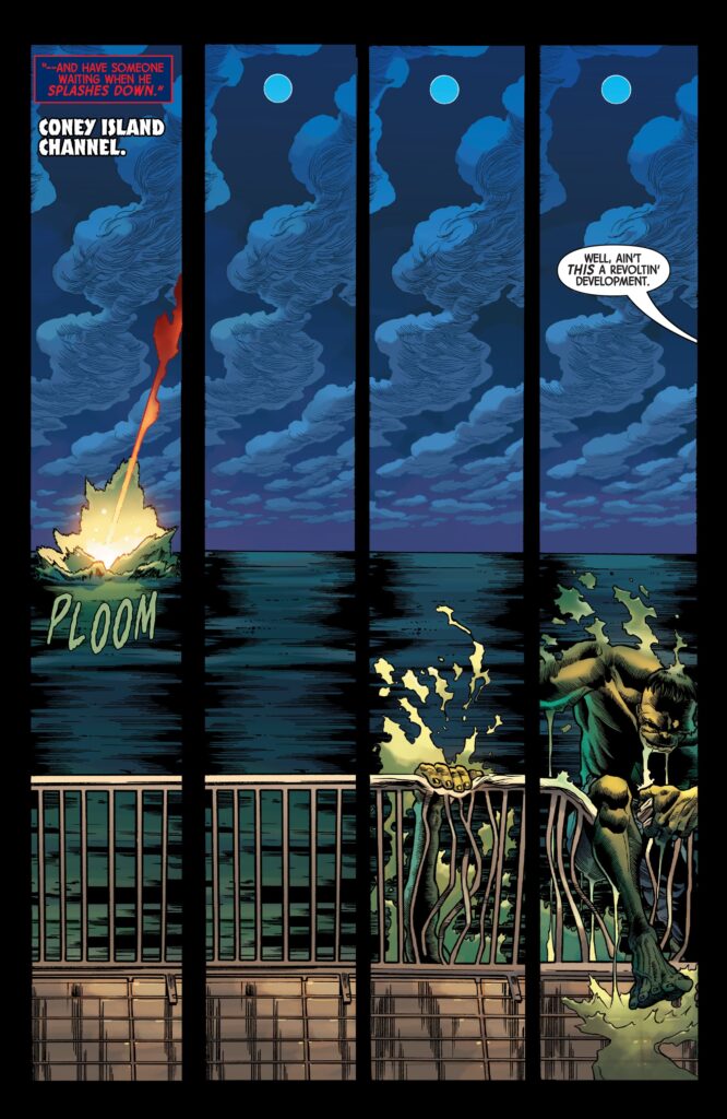


This is a really effective way to end the issue — because you do actually know what time it is, and here is in fact The Thing. It’s a good way to make the reader point and go ‘I get this reference!’ while also giving a punchy ending to what’s effectively a book chapter — especially when you’d have to wait a month to read the next issue, at least when this series was being released.
I also, personally, think the use of really big titles (like physically, often they get a whole page to themselves) helps to create the aesthetic of this book. Immortal Hulk deals a lot with a kind of biblical god, and the problem of evil — and having the titles be kinda meta helps reinforce this. There’s a higher plane the story is operating at — both in the actual story (when characters try to talk to god) and in the meta way the writer is talking with you, or talking with things the character can’t actually see (such as the title). One might say god talks to us, if god is real, in a similar way — using things we can’t see. And you can get all of that by just paying a little attention to where you decide to put the title — it’s economical, if nothing else.
So I guess I’m kind of making two points here — that where you put the words is important, and also that you can use all the words. The title and subheadings are physical things, and they’re a tool just like anything else.
I think it’s all too easy to think about writing as just the act of putting one word after another — when it’s also the act of where to put the words, or where not to. How big to make them, and what font to use. Now that everything is so digital maybe it’s easy to forget this.
And this is why I find the Substack editor so unbelievably annoying. There’s no center align! You’re very limited with which sizes you can make text. We’re constraining an entire generation of writers because conformity is easier to market — it’s absurd that the most popular blogging platform in the world is so much less feature rich than Google Docs.
Sometimes titles should be
Big
And
Punchy
And sometimes you should just write in a very standard college essay style. It depends on what you’re trying to convey. But it is important to remember that either way these are choices — choices that impact what your writing is conveying.
Because words are physical things.
Leave a Reply